In 2025, Riveo Creative teamed up with Hop Studios for assistance for their client, Athena Marketing International (AMI), who needed to upgrade their WordPress site and wanted to roll out a visual refresh—new logo, fonts, and colours. AMI is a marketing agency that helps North American food and beverage companies break into international markets, so their website needs to showcase their particular expertise, reflect their value, and make it easy for potential clients to find what they need.
AMI’s site highlights their services, features their impressive and diverse roster of clients, and keeps visitors updated on news and events. While their WordPress CMS core was admirably current, a few key components—PHP, the theme, and several plugins—needed some attention to keep everything running smoothly and securely.
We started by upgrading the site to an appropriately current version of PHP 8, which improved speed, security, and plugin compatibility. We also updated their chosen WordPress theme to the latest; which reduces the chance of bugs and improves overall stability. On top of that, we refreshed core plugins like Advanced Custom Fields PRO, Google Analytics, Sucuri Security, and Yoast SEO, and removed a few unnecessary ones to keep things lean and efficient.
To make sure we could implement changes without any risk to the live site, we set up a dedicated staging environment. This provided a secure space to test updates, add new features, and implement design changes. It also provided AMI with a protected place in which to review everything before it went live, making the approval process smoother and reducing the likelihood of surprises on all sides.
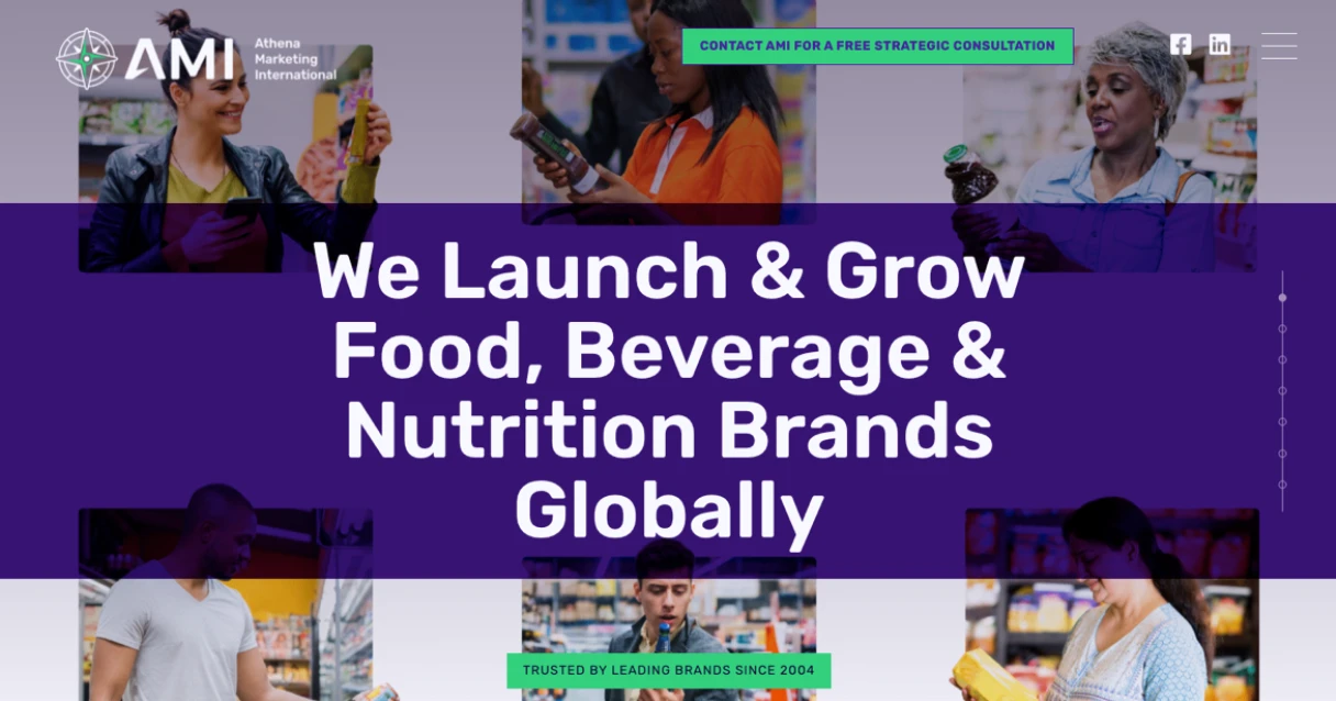
With the staging site ready to go, Riveo Creative directed us on bringing AMI’s new visual identity to life. The new logo was added with the full company name displayed next to it on desktop, while a more compact mobile-friendly version placed the company name underneath on smaller screens. We introduced bold new brand colours – Persian Indigo and Island Green — for a cohesive, modern look, and switched the fonts to Rubik SemiBold to give the site a sleek, contemporary feel. Throughout the process, we made sure to maintain strong colour contrast for accessibility and readability.
To boost user engagement, we added more call-to-action buttons throughout the site, directing visitors to the contact form. Now, no matter where someone lands, they can easily get in touch with the AMI team. It’s a small change, but it makes a big difference in streamlining communication and improving conversion rates.
We’re excited to see AMI’s refreshed site help them connect with more clients and grow their business. Ready to refresh your website and elevate your brand online? Contact us to learn how we can help your business succeed.
{extended}